FreshFind
Improved B2B onboarding process, redesigned vendor dashboard, and created interviewer guide.
Overview
Introduction
FreshFind is an online marketplace for purchasing fresh, local, handmade goods. For my internship at FreshFind, I was tasked with the opportunity to improve the vendor experience from onboarding to managing their account on their dashboard. I have been granted permission to share these materials as part of my portfolio and they do not contain all the content I created as part of this internship.
Team Members
Michael (Supervisor), Faith (UX Designer focused on consumer side), Reha (UX Designer focused on consumer side), Software Development Team
My Role
UX Designer (Research + Design) and Product Consultant
Strategy
How I Approached The Problem
- Current State Analysis + Requirements Gathering
- User Interviews, Usability Testing, and Surveys
- Insights Analysis
- Mid-fi wireframes
- Usability testing
- Hi-fi prototype
- Designer Feedback
- Developer Handoff
Current State Analysis + Requirements Gathering
Before I dove into problem definition, I wanted to understand FreshFind's business objectives, current website, competitors, and user base. To do this, I performed a website review and interviewed Michael, the co-founder of FreshFind. I took meeting minutes, shared my feedback on the current website, and noticed potential areas for improvement related to the vendor experience. Specifically, I noticed that the vendor onboarding process was confusing, long, and had an inconsistent design from the rest of the site. Additionally, the vendor dashboard's design was inconsistent with the FreshFind branding and it was difficult to figure out how to set up delivery options. To explore further, I wanted to view the perspectives of current and potential vendors.
Guiding Research Question
How Might We Improve the FreshFind Vendor Experience?
User Interviews, Usability Testing, and Surveys
I first created a survey using Google Forms specifically targeted towards vendors who did not complete the vendor onboarding process with the option for them to opt-in for a short interview to elaborate on their responses. I distributed it through email using contact information provided to me by Michael, including a brief message about the purposes of the survey. Unfortunately, I was unable to recruit any current vendors for an interview with the email, but I was able to acquire survey responses. I also recruited potential vendors for a user interview and usability test on the current FreshFind website. Michael was interested in seeing the user perspectives on the mobile and desktop site so for the 12 users I enlisted, I had half of them provide perspectives on the mobile site and the other half provide perspectives on the desktop site. For all groups, I followed a similar interview process.
I started with warm-up questions (e.g., demographics) to make participants feel more comfortable. Afterwards, I asked specific questions related to the version of the website they were seeing.
Insights Analysis
I used an Atomic UX Figma template to summarize my insights and opportunies for improvement. Because the file is quite large, it is best viewed through this link. I presented my insights to Michael and let him know my next steps. I also shared these insights with Faith and Reha, fellow interns who were working on the consumer side of the website redesign.
Mid-Fi Wireframes
My goal with the mid-fi wireframes were to simplify the onboarding process and make the design of the vendor dashboard more user-friendly and consistent with the FreshFind branding.
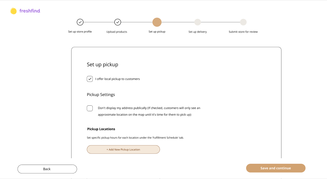
When redesigning the onboarding process, I took inspiration from Etsy. (Note that I created more frames than I showed in these pictures. These are just examples.)
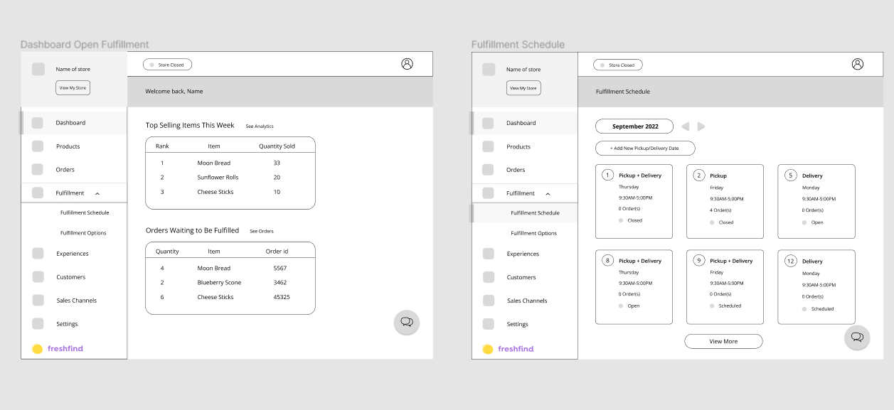
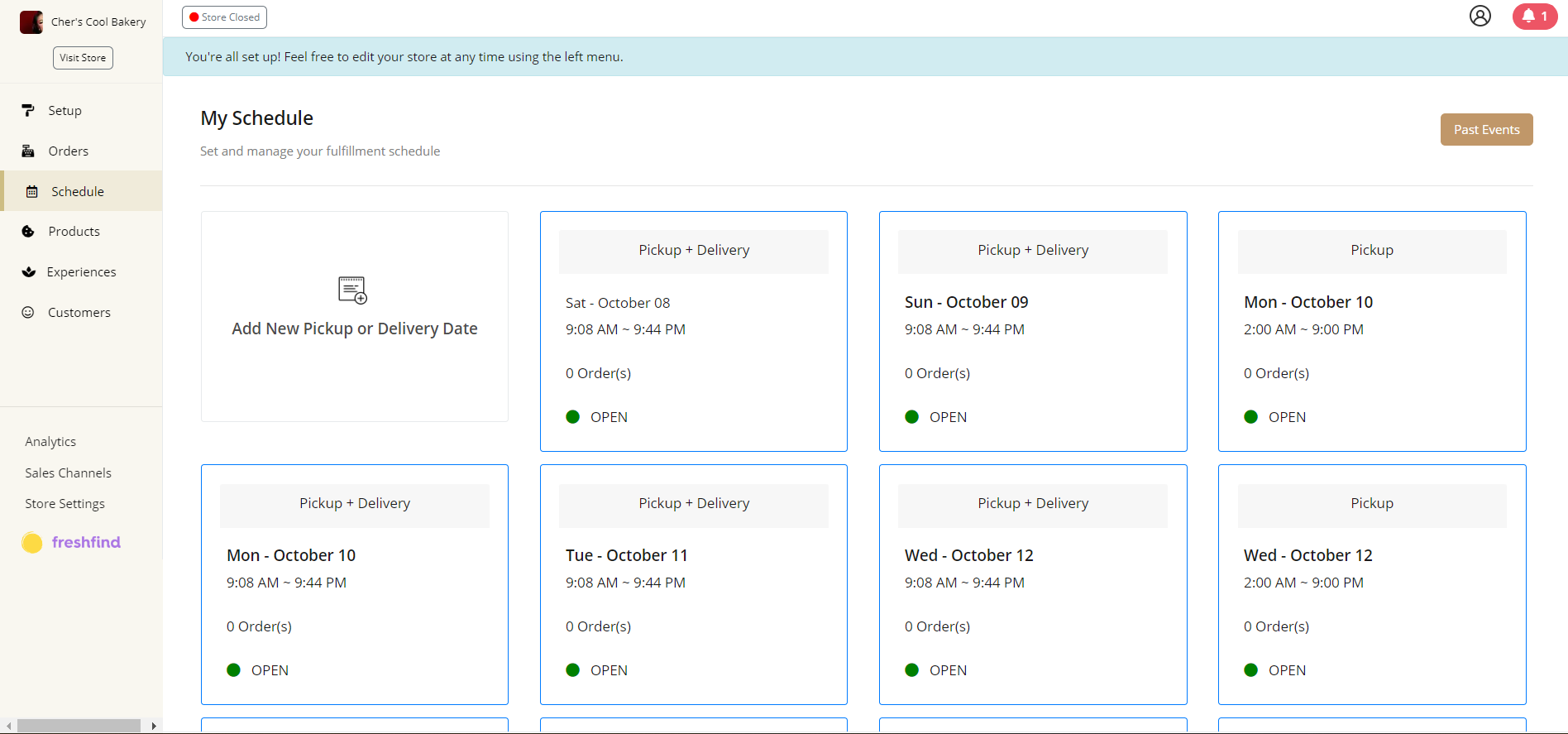
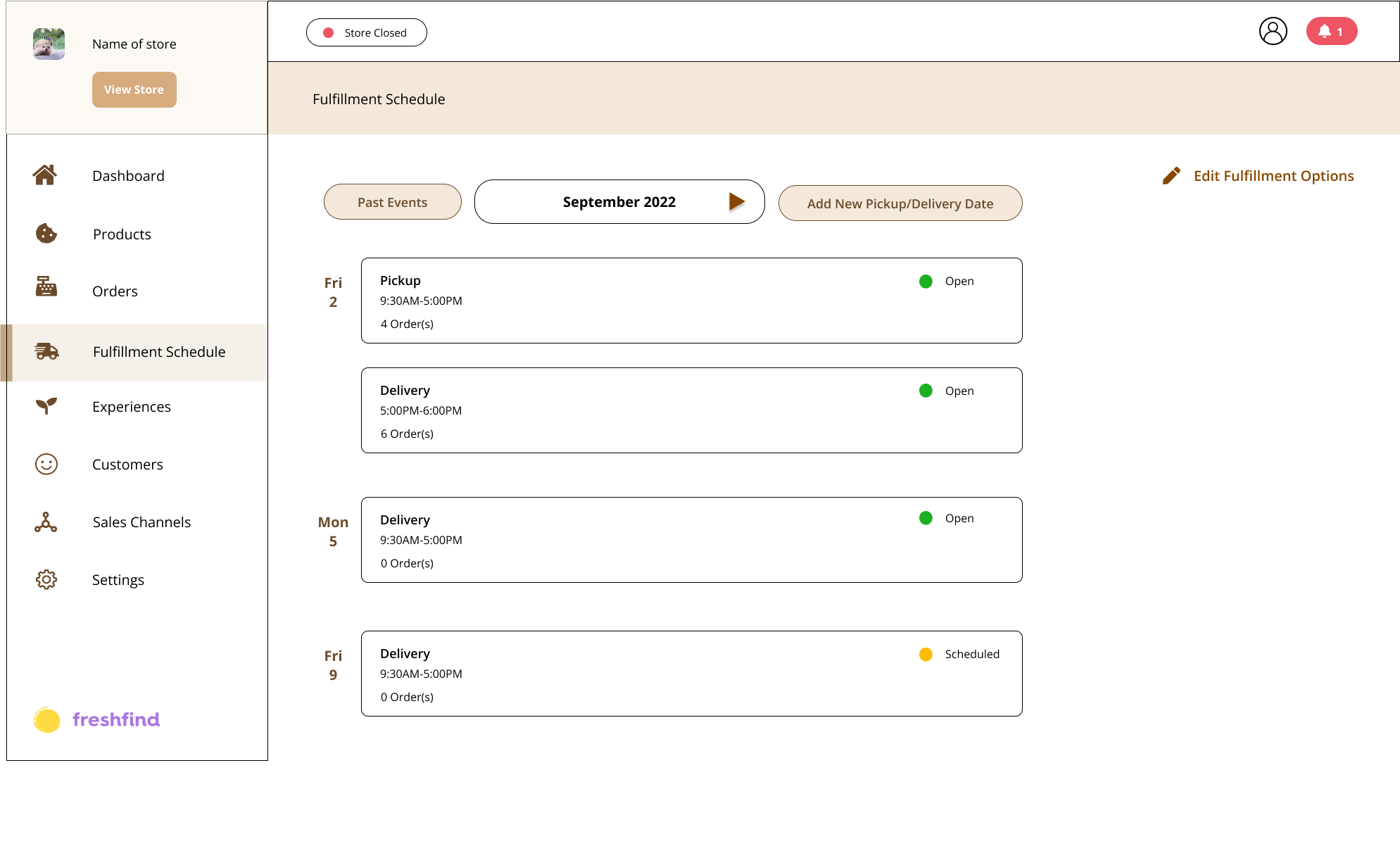
A few frames of the dashboard redesign.
Usability Testing
With my mid-fi wireframes, I was able to create a functional prototype for usability testing. I recruited 6 potential vendors to provide usability testing for my designs. While users enjoyed the simplicity of the onboarding process, they found setting up a delivery schedule in the dashboard confusing. As such, I consulted with Michael for his thoughts on my design and asked for advice on the dashboard. He provided me key information that needed to be gathered in the onboarding flow and suggested I take inspiration from Google Calendar. I considered his advice and also experimented with reorganizing the information architecture.
Hi-Fi Prototyping
After reworking my mid-fi prototype, I began adding in color and relevant content. I tested this new prototype with potential vendors and saw a 49% increase in the task completion of the onboarding process and a 5x increase in the task completion rate of setting up delivery in the dashboard.
Before I finalized my designs, I collaborated with Faith and Reha. We provided feedback for eachothers' designs and shared insights. After this, I created a final version that Michael, potential vendors, and I found delightful.
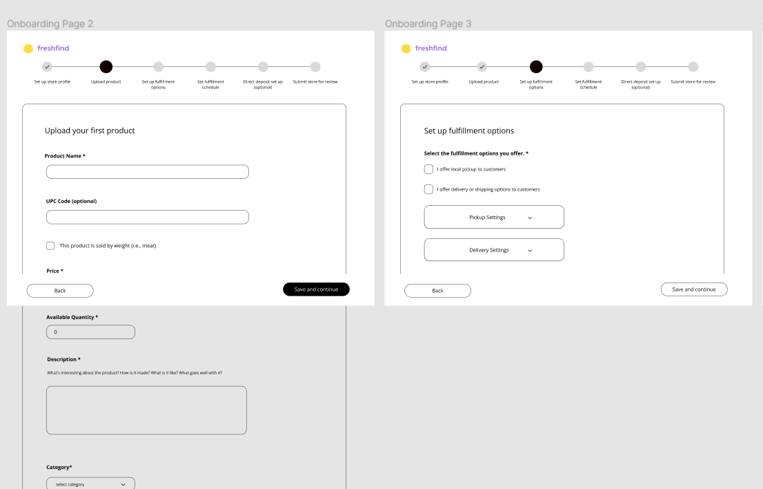
Onboarding Before
Onboarding After
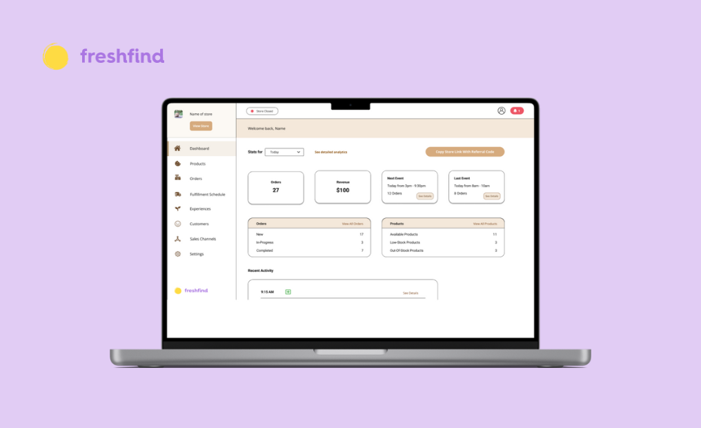
Dashboard Before
Dashboard After
Final Prototype
Below is a video of the final prototype.
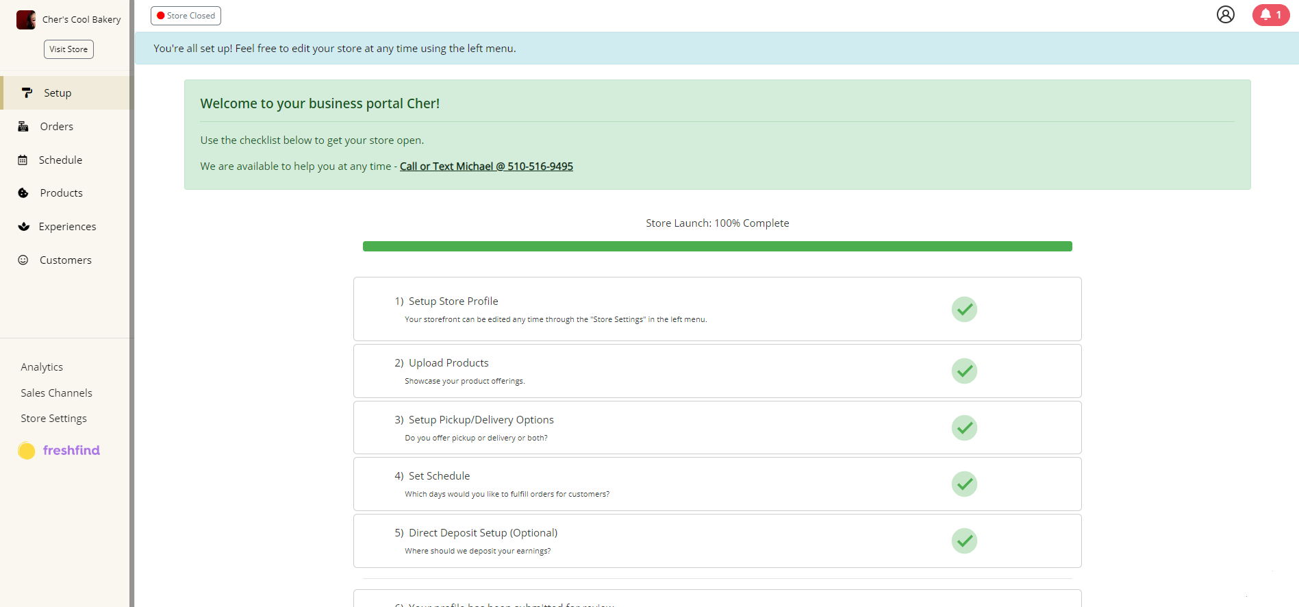
Developer Handoff
I shared my completed prototype with the FreshFind development team and made comments throughout my Figma file to clarify design choices and how they might be implemented. After the completion of this project, Michael requested if I was willing to share my interview template as document for future designers to use. He asked this because some of the potential vendors I interviewed reached out to him afterwards to compliment my interview skills. I agreed and created a template with tips for future interns to use.
Key Takeaways
Inspiration Is All Around You As Long As You Know Where To Look
From user feedback, to existing (well-designed) sites, to feedback from other designers, I learned to take advantage of a multitude of resources to create this redesign.
Cross-functional Collaboration
This internship was an amazing opportunity to work with multiple stakeholders and collaborators such as my supervisor (who has a software background), vendors (and potential vendors), other designers, and software developers. I communicated effectively with stakeholders and my teammates to help achieve the outcomes intended by this redesign.
Next Steps
Something I would do differently if I had the resources to is shorten my email template that I sent to the vendors and add a monetary incentive (could be something like a $10 site giftcard) to make providing feedback more enticing. The potential next steps for future interns with FreshFind would be to continue redesigning of the rest of the vendor dashboard to be more user-friendly.