Cart.io
A smart grocery shopping app for students.
Overview
Introduction
As a university student, I noticed that a lot of my peers were complaining about the rising costs of groceries due to inflation. I wanted to design an app that would help them save money and time when shopping for items they were going to buy anyway. This project was created as part of my UX design program from April 2022 - June 2022.
Problem
Groceries are getting more expensive and university students are finding it difficult and time consuming to stay in budget.
Goal
Design a smart grocery app for students to help them save time and money when grocery shopping.
Team Members
Jessie (UX mentor), Tiff (UX mentor)
My Role
UX Designer
Strategy
How I Approached The Problem
- User research
- User personas
- Solution
- Information architecture
- User flows
- Sketch
- Mid-fi wireframes
- Usability testing
- Hi-fi prototype
User Research
I interviewed 5 university students from UBC and Langara who are responsible for grocery shopping in their household.
I started with warm-up questions (e.g., demographics) to make participants feel more comfortable. Afterwards, I asked specific questions such as:
- Tell me about the last time you went grocery shopping
- Tell me about a time you could have stayed in budget while grocery shopping but ended up spending more than you anticipated.
User Research Insights
- Grocery lists would improve the grocery shopping experience by helping students remember what they have to buy and stick to their budget so they can save money for tuition and other expenses.
- Smart store suggestions based on the student’s budget, location, and grocery list items would improve the grocery shopping experience by helping students save time on commute and save money on purchases so they can focus on studying, friends, and extracurriculars.
- Virtual coupons that are relevant to the students’ grocery list would improve the grocery shopping experience by helping students save money on-the-go so they can feel relieved knowing that they aren’t missing out on a deal.
- Cash back would improve the grocery shopping experience by helping students save money items they planned on buying anyway so they can feel less guilty about spending money on necessary expenses.
- The option to shop for groceries virtually would improve the grocery shopping experience by helping students save time on commute so they can focus on studying, friends, and extracurriculars.
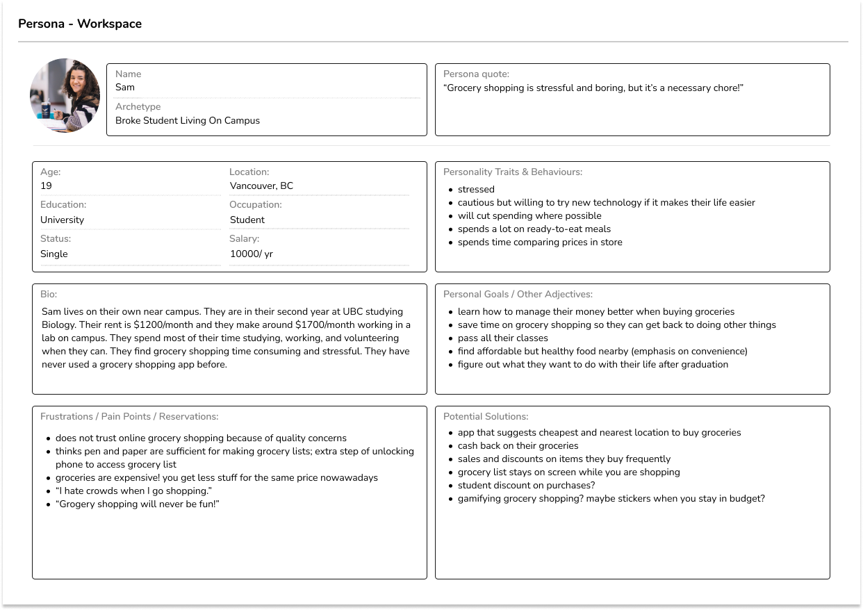
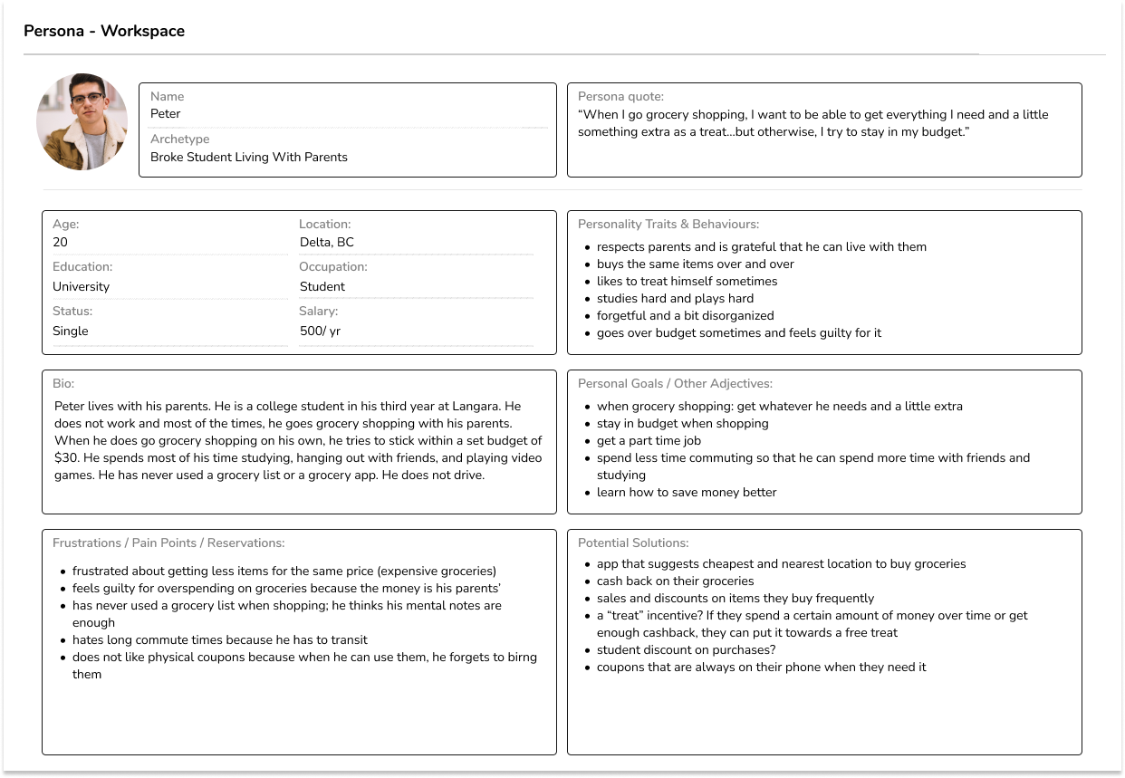
User Personas
From my research, I created two personas.
Solution
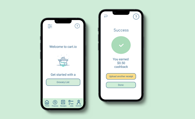
Cart.io is an all-in-one grocery shopping app that allows students to save time and money.
Its main unique feature is a smart built-in grocery list that suggests stores nearby. After students make a list, cart.io uses AI to suggest the best stores (online and/or in-person) based on the student’s budget and location by picking the stores with the most items on their list at the best price so students can save money and commute time.
Additionally, to help students save money, it also suggests coupons relevant to the groceries selected and allows students to upload receipts for cash back.
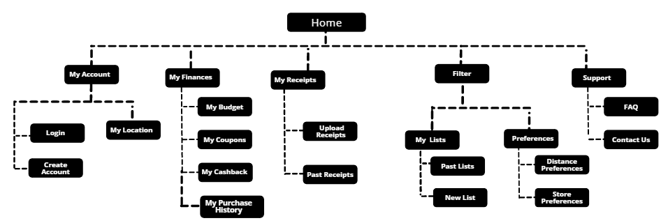
Information Architecture
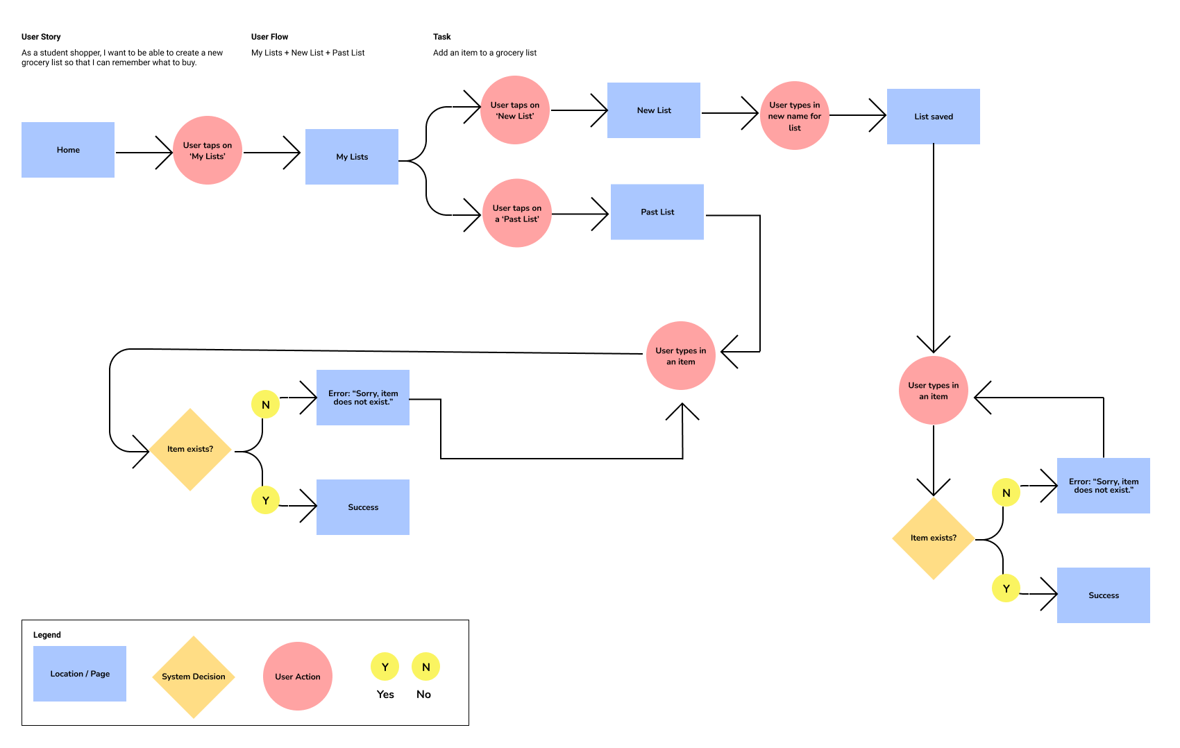
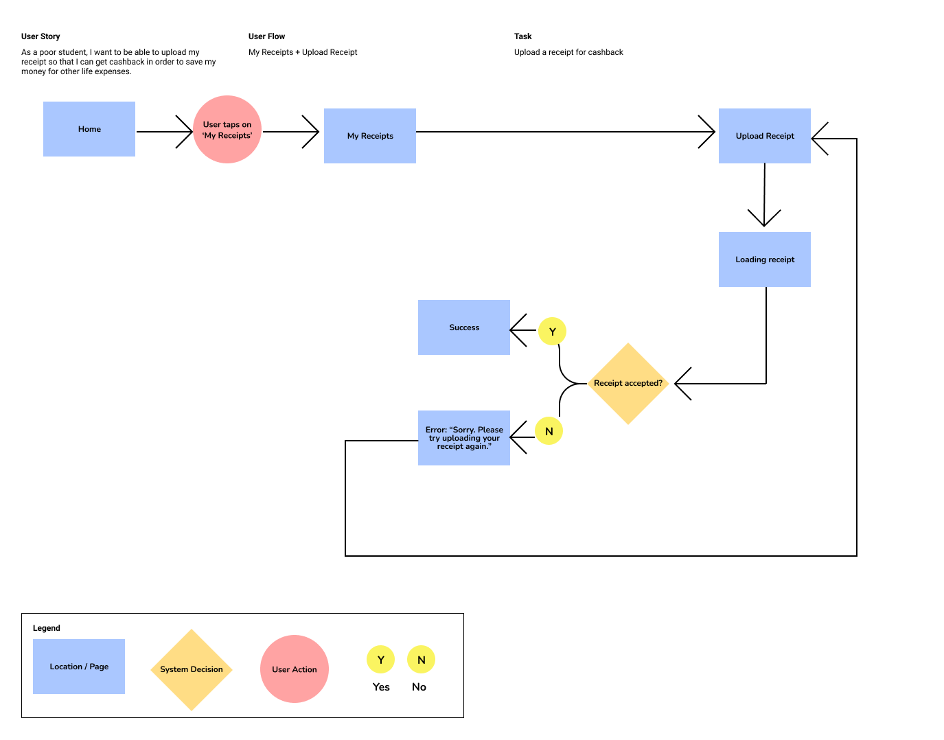
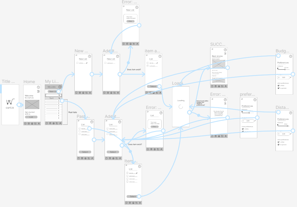
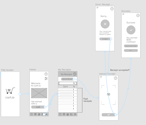
User Flows
Task 1: Add item to list & find best store
Task 2: Upload receipt for cashback
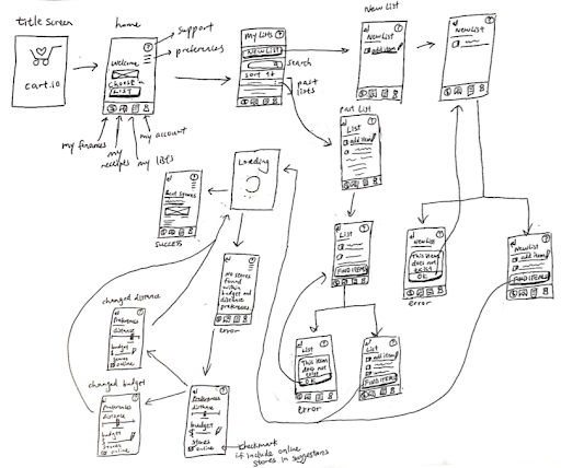
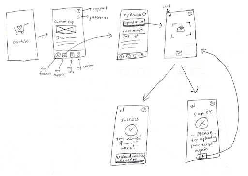
Sketches
Task 1: Add item to list & find best store
Task 2: Upload receipt for cashback
Mid-fi Wireframes
Task 1: Add item to list & find best store
Task 2: Upload receipt for cashback
Usability Testing
I conducted usability testing with 5 students. Students were given tasks related to the two user flows mentioned above.
The first task was to add item to list & find the best store for their list. This task had a completion rate of 40%.
The second task was to upload a receipt for cashback. This task had a completion rate of 80%.
Results & Improvements
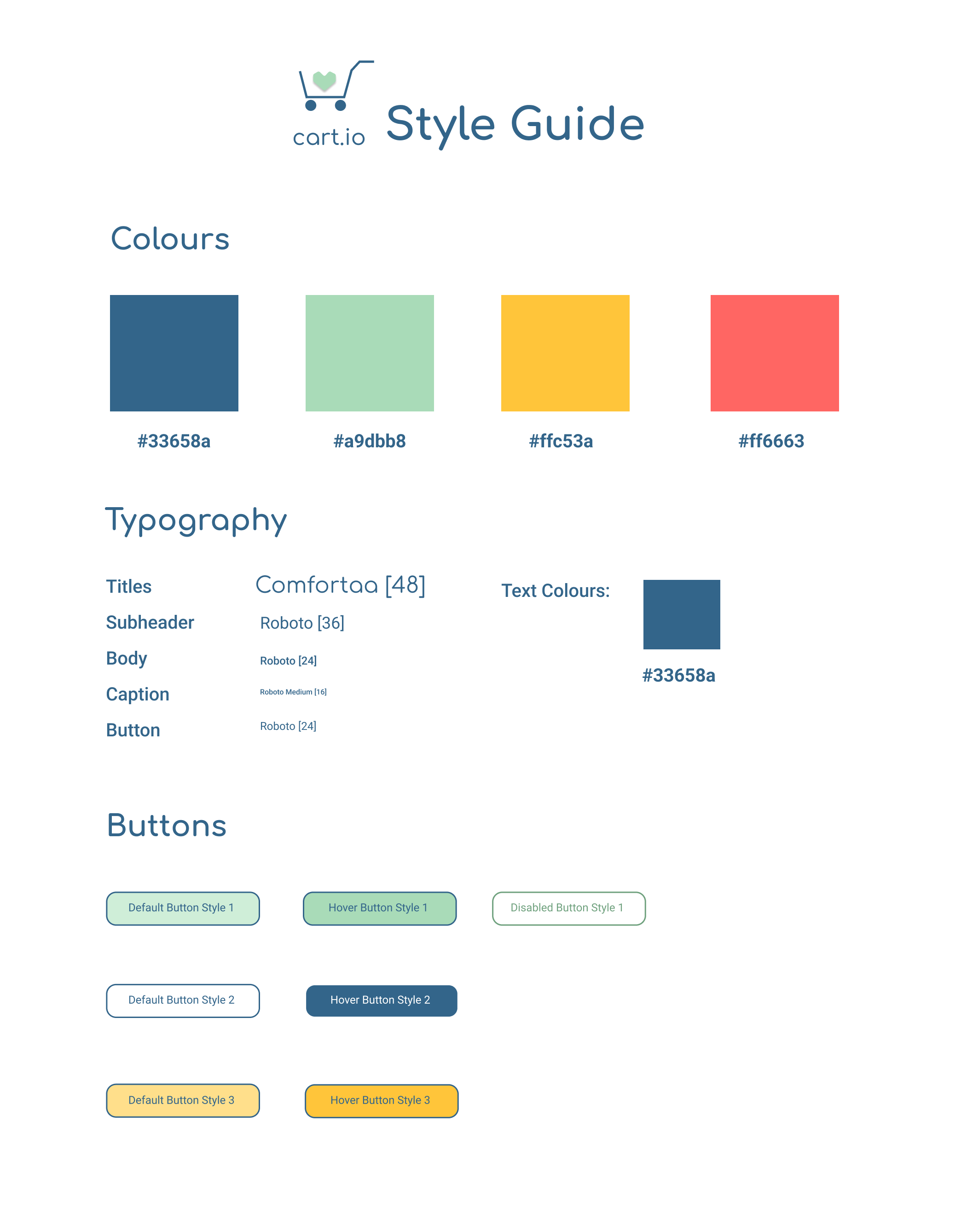
style Guide
To make the restyling process more consistent, I created a style guide.
General Improvements
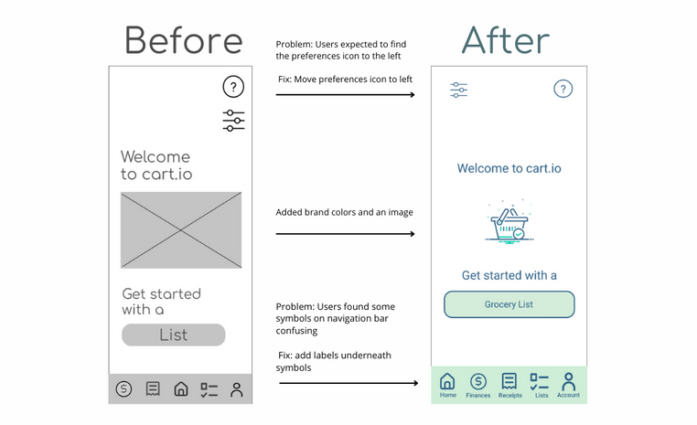
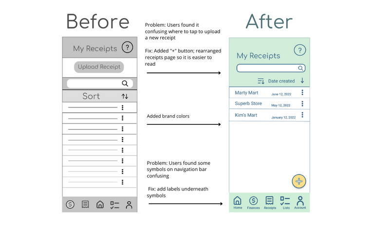
- Problem: Users found some symbols on navigation bar confusing Fix: Add relevant labels underneath symbols
- Problem: My Lists and My Receipts page were hard to understand- where past lists & receipts were located were confusing and the design was unappealing to look at (too much stuff to look at) Fix: make the colors more minimal, add the “New List/New Receipt” button as a “+” on the right hand corner where their thumb usually is. Researched references like Samsung Note
- Problem: Users were confused which buttons were clickable Fix: add different button states for hover and default, add border for button
Home Page Improvements
My Receipts Page Improvements
Final Prototype
After making the improvements, I conducted another round of usability testing with 5 users using the same 2 tasks (i.e., adding an item to a list, uploading a new receipt). It was found that the improvements increased the completion rate of adding an item to a list by 150% and the completion rate of uploading a new receipt by 25%.
Below is a video of the final prototype.
Key Takeaways
Users Can Offer Valuable Perspectives
Conducting interviews and multiple rounds of usability testing allowed me to improve my prototype to be easier to use as well as easier on the eyes. Sometimes, participants were able to notice things that I did not notice at first. Honest feedback and criticism taught me about key interaction design principles, design principles, and not only helped improve my prototype but also helped improve my design skills.
The UX Design Process Is Iterative
This was my very first UX design project where I went from problem to prototype. It was an intimidating process at first, but it felt invigorating knowing how much I learned from it. Even when I was "done" my hi-fi prototype, I knew that with more time and research, I could improve my app.
Next Steps
Although Cart.io was a blast to make, it is far from perfect. For example, while it is true that Cart.io is targeting students, it should eventually show the merchant side as well. This is because merchants would need to list their promotions and coupons on the app as well. Additionally, the prototype could be improved with more functionality to the finance and account section. The overall design of the app could also be improved to be cleaner and have more whitespace so that the content appears less "squished".